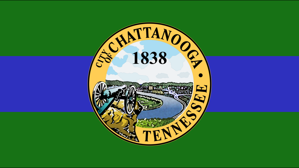
Goooooood morning, Chattanooga. 👋 It’s Friday — let’s have some fun. Trista here, and I love talking about design, especially when it comes to city flags. Maybe you’re thinking, this doesn’t sound fun at all, but trust me, it is. City flags are designed much more specifically than state + country flags. They are meant to build local pride + loyalty by representing the essence of the city, so the topic can get quite controversial.

The current city flag, adopted in 2012. | Photo by NOOGAtoday
Wait, when did our city flag change?
While some cities have had their flag flying for a century or more, Chattanooga’s flag got a new look in 2012. City Council voted to redesign the flag that had been over our city since 1923 with something that better represented our modern reputation and looked less like the state flag. They wanted the new flag to support the city’s rebranding efforts as “Scenic City.”
Whether you love or hate the new design, it’s here to stay, so we might as well dig into the specifics.
Colors
The background of the flag is a green + blue triband. The color green is meant to represent mountains while the color blue stands for the Tennessee River, which flows between the mountains. In the middle is the city seal.
The city seal
The flag isn’t the only city symbol to get an upgrade — in 1975, the city adopted a new seal illustrated by George Little, who won the first place prize of $500 in a contest to redesign the seal. He depicted a view of the city from Point Park, including a cannon from the Lookout Mountain Battlefields overlooking the river, city + mountains in the distance.
New flag reception
As I mentioned before, City Council decided the old flag represented what Chattanooga was, not what it is, but not everyone else felt the same. A lot of Noogans loved the simple design of the former flag, and some even said the new flag was an act of heresy, while others just didn’t understand the need for a redesign.
However you feel about the flag that flies over our city, at least it isn’t Milwaukee’s flag. 🤷
Poll


